Hubspot is a fantastic marketing tool, and they’ve built an impressive company through content marketing. I find it allthemore surprising that the CTAs in their own blog posts are still looking that poor though.
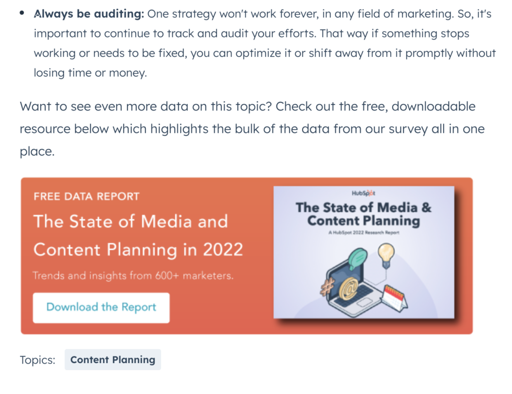
Take this example from a blog post they’re featuring prominently on their marketing blog page right now, in February 2023:

The content itself is great, but why the low resolution graphical CTA? It just looks poorly done, and personally I wonder why they don’t upgrade this.