I’m currently taking a free course from the Google Analytics Academy on anaytics fundamentals, and this video is super valuable if you want to get a very quick overview of Google Analytic’s reporting features that you can use to poke the data you’ve got in there a bit:
It’s super basic, but a great starting point. Some of the things it covers:
- how to change date ranges for your reports (and compare to other date ranges)
- how to change the granularity of the visual time graph (by day, week or month)
- how to add annotations to specific dates (super useful, I use this all the time as it gives a lot of useful context to historical data when you’ll look at it in the future)
- how to choose a default metrics for each view (and add a secondary metric to overlay that and be able to compare it)
- a quick overview over data tables
It’s useful to know the name of these, just so you’ve got the basic terminology of GA down.
Data tables break down your data by a single dimension (most of the time). Each table row shows the data for a different value of the dimension
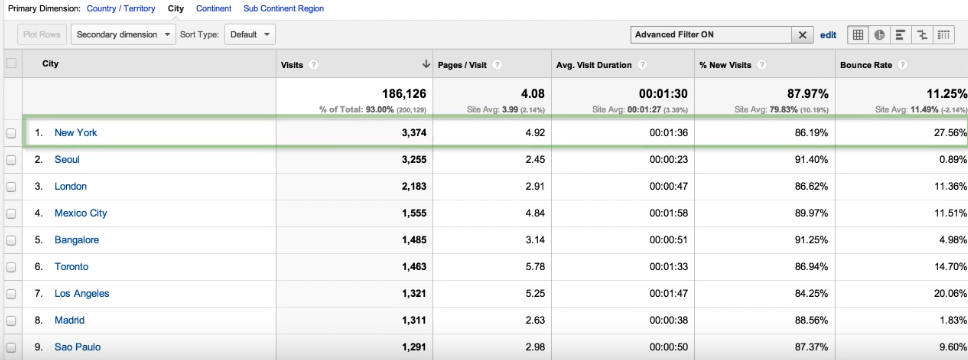
- In data tables, you can not only change the primary dimension and add a secondary dimension, but also choose which sets of metrics will be displayed for each dimension. The most common set of metrics is probably the Site Usage set which will show things like number of visits, pages per visit, time on page, bounce rate, and so on.
- How to filter the data in data tables using simple search queries
- How to filter the data in data tables by using advanced filters, which allow you for example to show only data where the minimum amount of Visits is above 200, or where the average time on sit is at least 1 minute, or whatever filter will best match your needs.
- How to change the way data is visualized using the view options (by default, most reports show the data view. But there’s also a percentage view that shows a pie chart, and you can choose which metric to be showed as a pie chart. There’s also a performance view, a comparison view and a pivot view
- how to plot multiple rows of data
This was a super useful feature that I wasn’t even aware of until recently, but it’s now one of my favorite features that I use quite often!
Let’s expand a bit on plotting multiple rows of data.
You probably are familiar with this common view of a graph in GA, which plots the number of sessions over a given date range:
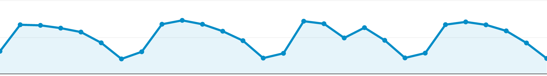
What you can do now is to select additional rows from the data table to be plotted in that graph, in this case, it’s the number of sessions plus various traffic sources which you can see plotted in other colors:

I never paid much attention to this, because for me, the term “Plot Rows” wasn’t clear.
But if you look at the meaning, it becomes pretty obvious:
to plot: make a curve by marketing out a number of points on a graph
rows: refers to the rows you select in the data table
Shortcuts in GA
Another cool thing you can learn from this video is how to quickly access custom views that you want to use repeatedly. You can just save them as a shortcut in GA!
Simply click on “Shortcut”, give this shortcut a name, and you’ll be able to access it with just the click of a mouse button.
The shortcuts are available to you in the menubar on the left.